What Is Behind The Word “UX Design”?
24 February 2021
For many people, the development of an application is associated with the programming of countless code in a black window and a graphic design so what is created is pleasing to the eye. Few people know, however, that there is one more magical person who tries to adapt the resulting work in such a way that it is legible, intuitive to use, and, at the same time, does not frighten with blockiness and cause positive emotions to users. That someone is quite an exotic-sounding UX designer.
What such a person does, what factors must be taken into account when designing an application and what the process of creating a product looks like from the perspective of a user experience designer, I will try to explain in my post.
UX design what is it about?
Let’s start with the basics, what exactly is user experience design (UX for short)? According to the authors of the book “Badania jako podstawa projektowania user experience” (“Research as the basis of user experience design”) Iga Mościchowska and Barbara Rogoś-Turek the essence of user experience can be described by three product features:
- Utility,
- Attractiveness,
- Providing positive emotions.
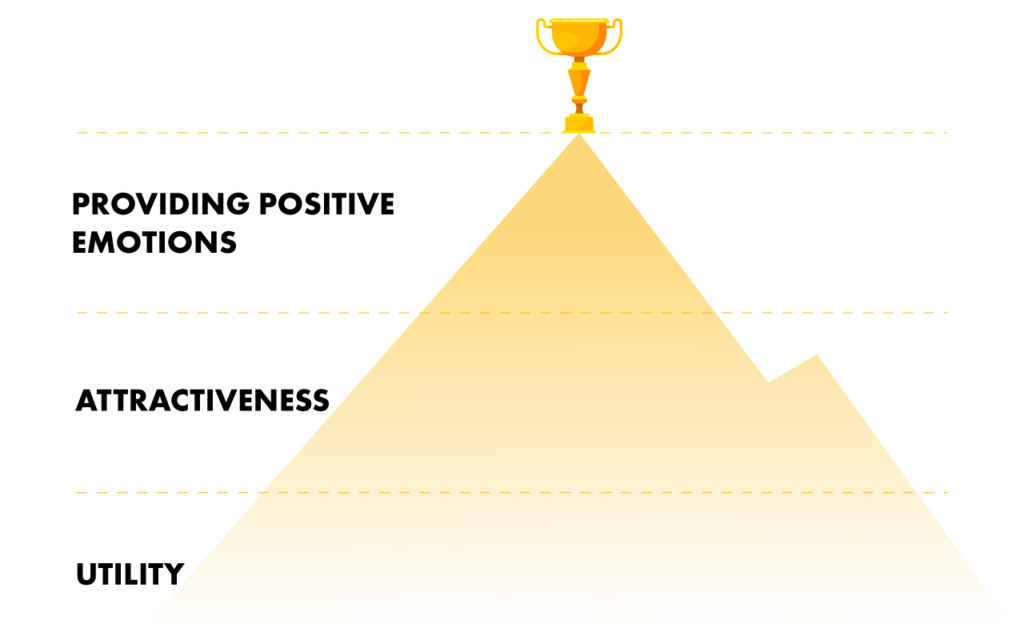
What does it mean? That the product should be intuitive and easy to use. It should encourage us to use it and be eye-friendly. And it is supposed to cause positive emotions during its use. These are extremely important features that can determine the success of a designed applications. Because, let’s be honest, who would like to use an annoying, ugly as night and overwhelming app? Hardly anyone would decide to take such a step, even if the application would provide revolutionary patents and would be well programmed. That is why it is so important that the experience of using our products is as friendly as possible. By combining these three features, we can expect that our business goals will be met, and at the same time we will build a positive brand image that can encourage recipients to use other products of ours.
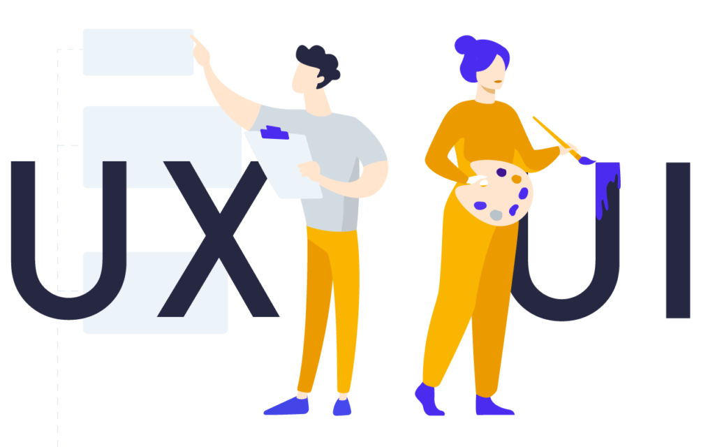
However, don’t get caught up in the trap! User experience (UX) is not the same as User Interface (UI)! The easiest way to show these differences is the example of a car. Beautiful red color, aggressive, sporty look, chrome mirrors, this is UI, which is everything that pleases our eye. UX, on the other hand, will be what we have under the hood. All the facilities that affect our comfort and driving pleasure. As in the example above, one is related to the other but is not the same. There is a synergy between them, which translates into the success of this car. UI designer focuses more on the appearance of the interface, and the UX designer on making the product useful and how the user will interact with the product.
One more very important thing. UX should not be applied topically. Sure, when the budget is flushed to the limit and deadlines are chasing, you can limit yourself to improving the usability of one element, but it is not advisable. Overall, the product should be dealt with comprehensively and parts of it should be consistently improved to make the overall user experience as positive as possible.
User experience and the process of creating a product
Before we start designing UX for our product, there are a few things we need to think about. The first stage should be an analysis in which we should include the requirements from the client and identify the user’s needs. It is also worth getting acquainted with the solutions already existing on the market, if there are any. If there was already an earlier version of the product, we can use it to identify its defects and shortcomings and propose new solutions. Which will also have a positive impact on the course of further works.
Knowing what and how to do on the basis of the above data, it will allow us to formulate conclusions that can be used in the next stages of the creation process.
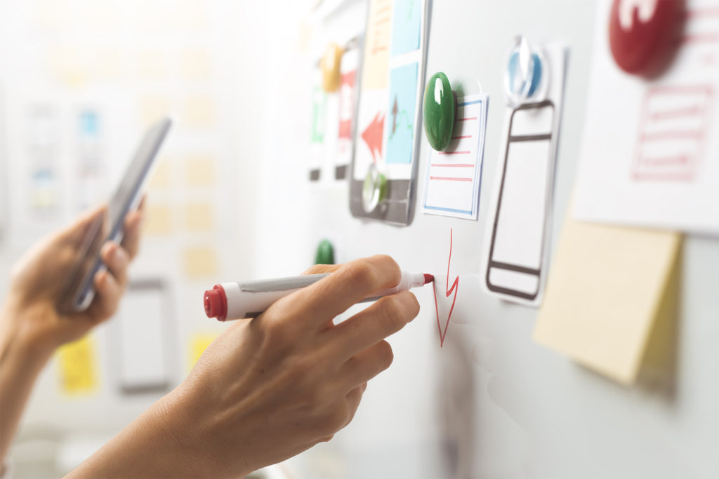
Armed with a lot of information, we can start designing functional mockups that focus more on functionality than appearance. This step is very important as it allows us to catch errors that may affect the product in later stages. The mock-ups are designed in such a way that they are interactive and initial functionality and usability tests can be performed. It is also the first stage in which the client actively participates in the form of consultations.
The next stop on our UX design journey will be evaluation. At this stage, our efforts, for the first time, collide with users who test the solutions we propose. Each of us is different, has different experiences and habits. What seemed clear and intuitive for us when designing UX may turn out to be not obvious or misleading to someone else. Therefore, it is worth sticking to proven solutions, because it increases the chance that the user will find himself in it. As a rule, we like repetition till it hurts. We instinctively know the top left corner that we can click on and return to the home page. The impossibility of this movement can make us irritated and confused. It’s a bit like swapping the brake with gas. This may result in the recipient not coming back to our product because they think that they are wasting their time using it. Always keep in mind that our solution should not force the user to think longer. Intuitiveness plays a very important role here.
After a successful evaluation, we slowly move to the culminating moment of product implementation and development. Here, our previously developed UX strategy begins to take real shape. At this stage, the role of UX designer is limited only to monitoring and verification of selected elements and the implementation of possible improvements and modifications to the project.
It should also be borne in mind that not all UX designer ideas are implemented in the final product. Very often you have to give up your own preferences and make some compromises and limitations.
Is it possible to create an application without the help of a UX designer?
Of course you can. Same as you can enter the house through the basement. However, this is a non-intuitive solution, although it does the job. A good UX designer will be able to guide the user so that, before he enters the house, he will follow a green and pleasantly smelling avenue that will lead him directly to the front door. Apparently in both cases we will achieve the chosen goal, but the second option shall be much more pleasant.
Sure, these are additional costs and extending the product development cycle with additional work, but such an approach will certainly pay off with measurable benefits. And not only for users, but also for businesses. The company benefits by increasing its chances of success in the overcrowded app market. What’s more, thanks to the work of the UX designer, many errors are detected at an early stage of creating functional mock-ups. It also partially relieves programmers from additional work, because it is easier to modify mockups than the code itself. However, the user gets an intuitive application that encourages him to use it.

Summary
The UX designer is not a necessary person, but brings a lot of benefits to the created product. It is he who is behind the design of the application in such a way that it is understandable, even requiring no additional explanations for the average user. The mere interaction with our project is very pleasant for him and meets his needs with ease. UX design is what road signs leading to a specific town are. We are always sure that we will reach the right address.


